
1.表单设计
表单主要功能是用来与用户做交流的一个网页控件,良好的表单设计能够让网页与用户更好的沟通。表单中常见的元素主要包括:文本输入框、下拉选择框、单选按钮、复选按钮、文本域和按钮等。
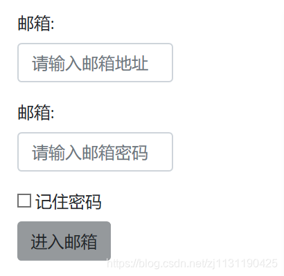
(1) 基础表单
<!DOCTYPE html>
<html lang="en">
<head>
    <meta charset="UTF-8">
    <meta http-equiv="Content-Type" content="text/html; charset=utf-8">
    <title>Title</title>
    <!--引入bootstrap-->
    <link href="../../css/bootstrap.css" rel="stylesheet" type="text/css">
    <link href="../../css/index/index.css" rel="stylesheet" type="text/css">
</head>
<body>
    <!--表单-->
    <div class="form-area">
        <form role="form">
            <div class="form-group">
                <label class="email_label">邮箱:</label>
                <input type="email" class="form-control" id="email_input" placeholder="请输入邮箱地址">
            </div>
            <div class="form-group">
                <label class="email_pwd">邮箱:</label>
                <input type="password" class="form-control" id="email_password" placeholder="请输入邮箱密码">
            </div>
            <div class="checkbox">
                <label>
                    <input type="checkbox"> 记住密码
                </label>
            </div>
            <button type="submit" class="btn">进入邮箱</button>
        </form>
    </div>
</body>
</html>

(2) 水平表单
Bootstrap框架默认的表单是垂直显示风格,但很多时候我们需要的水平表单风格(标签居左,表单控件居右)见下图。
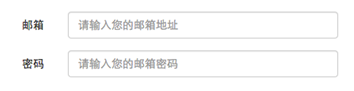
输入框:在bootstrap中输入控件必须指定type,制定输入的类型
<form role="form">
  <div class="form-group">
    <input type="email" class="form-control" placeholder="Enter email">

  </div>
</form>
下拉选择框:Bootstrap框架中的下拉选择框使用和原始的一致,多行选择设置multiple属性的值为multiple。Bootstrap框架会为这些元素提供统一的样式风格。
<!DOCTYPE html>
<html lang="en">
<head>
    <meta charset="UTF-8">
    <meta http-equiv="Content-Type" content="text/html; charset=utf-8">
    <title>Title</title>
    <!--引入bootstrap-->
    <link href="../../css/bootstrap.css" rel="stylesheet" type="text/css">
    <link href="../../css/index/index.css" rel="stylesheet" type="text/css">
</head>
<body>
    <form role="form">
        <div class="form-group">
            <select class="form-control">
                <option>1</option>
                <option>2</option>
                <option>3</option>
            </select>
        </div>

        <div class="form-group">    <!--多行选择需要设置multiple-->
            <select multiple class="form-control">
                <option>1</option>
                <option>2</option>
                <option>3</option>
            </select>
        </div>
    </form>
</body>
</html>
3. 文本域(textarea)
文本域和原始使用方法一样,设置rows可定义其高度,设置cols可以设置其宽度。但如果textarea元素中添加了类名“form-control”类名,则无需设置cols属性。因为Bootstrap框架中的“form-control”样式的表单控件宽度为100%或auto。
<body>
<form role="form">
<div class="form-group">
<textarea class="form-control" placeholder="输入你的信息"></textarea>
</div>
</form>
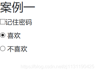
</body>4 .单选框和复选框:Bootstrap框架中checkbox和radio有点特殊,Bootstrap针对他们做了一些特殊化处理,主要是checkbox和radio与label标签配合使用会出现一些小问题(最头痛的是对齐问题)。使用Bootstrap框架,开发人员无需考虑太多,只需要按照下面的方法使用即可:
<!DOCTYPE html>
<html lang="en">
<head>
    <meta charset="UTF-8">
    <meta http-equiv="Content-Type" content="text/html; charset=utf-8">
    <title>Title</title>
    <!--引入bootstrap-->
    <link href="../../css/bootstrap.css" rel="stylesheet" type="text/css">
    <link href="../../css/index/index.css" rel="stylesheet" type="text/css">
</head>
<body>
    <form role="form">
        <div class="h3">案例一</div>
        <div class="checkbox">
            <label>
                <input type="checkbox" value="">记住密码
            </label>
        </div>
        <div class="radio">
            <label>
                <input type="radio" name="options_radios" id="option_s1" value="love" checked>
                喜欢
            </label>
        </div>
        <div class="radio">
            <label>
                <input type="radio" name="options_radios" id="option_s2" value="unlove">
                不喜欢
            </label>
        </div>
    </form>
</body>
</html>
结果:
如果需要将checkbox和radio_box放置在同一行中,可以使用inline-checkbox和inline-radio属性
<form role="form">
  <div class="form-group">
    <label class="checkbox-inline">
      <input type="checkbox"  value="option1">游戏
    </label>
    <label class="checkbox-inline">
      <input type="checkbox"  value="option2">摄影
    </label>
    <label class="checkbox-inline">
    <input type="checkbox"  value="option3">旅游
    </label>
  </div>
  <div class="form-group">
    <label class="radio-inline">
      <input type="radio"  value="option1" name="sex">男性
    </label>
    <label class="radio-inline">
      <input type="radio"  value="option2" name="sex">女性
    </label>
    <label class="radio-inline">
      <input type="radio"  value="option3" name="sex">中性
    </label>
  </div>
</form>
5. 按钮:
按钮是表单重要控件之一,制作按钮通常使用下面代码来实现:按钮的类型如下所示:
[type=“submit”]
[type=“button”]
[type=“reset”]
<!DOCTYPE html>
<html lang="en">
<head>
    <meta charset="UTF-8">
    <meta http-equiv="Content-Type" content="text/html; charset=utf-8">
    <title>Title</title>
    <!--引入bootstrap-->
    <link href="../../css/bootstrap.css" rel="stylesheet" type="text/css">
    <link href="../../css/index/index.css" rel="stylesheet" type="text/css">
</head>
<body>
    <table class="table table-bordered table-striped">
        <thead>
            <tr>
                <th>按钮</th>
                <th>属性</th>
                <th>按钮功能</th>
            </tr>
        </thead>
        <tbody>
            <tr>
                <td><button class="btn">默认的按钮</button></td>
                <td><code>btn</code></td>
                <td>默认的标准按钮</td>
            </tr>
            <tr>
                <td><button class="btn btn-primary">Primary按钮</button></td>
                <td><code>btn btn-primary</code></td>
                <td>Primary按钮</td>
            </tr>
            <tr>
                <td><button class="btn btn-info">Info按钮</button></td>
                <td><code>btn btn-info</code></td>
                <td>信息显示按钮</td>
            </tr>
            <tr>
                <td><button class="btn btn-success">Success按钮</button></td>
                <td><code>btn btn-success</code></td>
                <td>Success按钮</td>
            </tr>
            <tr>
                <td><button class="btn btn-warning">Warning按钮</button></td>
                <td><code>btn btn-warning</code></td>
                <td>Waring按钮</td>
            </tr>
            <tr>
                <td><button class="btn btn-danger">Danger按钮</button></td>
                <td><code>btn btn-danger</code></td>
                <td>Danger按钮</td>
            </tr>
        </tbody>
    </table>
</body>
</html>
一般制作按钮除了使用<button>标签元素之外,还可以使用<input type="submit">和<a>标签等。同样,在Bootstrap框架中制作按钮时,除了刚才所说的这些标签元素之外,还可以使用在其他的标签元素上,唯一需要注意的是,要在制作按钮的标签元素上添加类名“btn”。如果不添加是不会有任何按钮效果。
<!DOCTYPE html>
<html lang="en">
<head>
    <meta charset="UTF-8">
    <meta http-equiv="Content-Type" content="text/html; charset=utf-8">
    <title>Title</title>
    <!--引入bootstrap-->
    <link href="../../css/bootstrap.css" rel="stylesheet" type="text/css">
    <link href="../../css/bootstrap.min.css">
    <link href="../../css/bootstrap-grid.min.css">
    <link href="../../css/index/index.css" rel="stylesheet" type="text/css">
</head>
<body>
    <button class="btn btn-default" type="button">button标签按钮</button>
    <input type="submit" class="btn btn-default" value="input标签按钮"/>
    <span class="btn btn-default">span标签按钮</span>
    <div class="btn btn-default">div标签按钮</div>
</body>
</html>
按钮的大小也可以通过btn-lg,btn-sm属性来进行控制。
7. 表单中空间的大小
前面看到的表单控件都正常的大小。可以通过设置控件的height,line-height,padding和font-size等属性来实现控件的高度设置。不过Bootstrap框架还提供了两个不同的类名,用来控制表单控件的高度。这两个类名是:
input-sm:让控件比正常大小更小
input-lg:让控件比正常大小更大
这两个类适用于表单中的input,textarea和select控件,具体使用如下:
<body>
<div class="h1">
表单控件的大小控制
</div>
<form role="form">
<div class="form-group">
<label class="custom-control-label">控件变大</label>
<input type="email" class="form-control input-group-lg" placeholder="更大的控件">
</div>
<div class="form-group">
<label class="custom-control-label">控件变小</label>
<input type="email" class="form-control input-group-sm" placeholder="更小的控件">
</div>
</form>
</body>
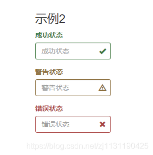
</html>表单的状态:焦点状态, 禁用状态,验证状态
在制作表单时,不免要做表单验证。同样也需要提供验证状态样式,在Bootstrap框架中同样提供这几种效果。
1、has-warning:警告状态(黄色)
2、has-error:错误状态(红色)
3、has-success:成功状态(绿色)
使用的时候只需要在form-group容器上对应添加状态类名。
<!DOCTYPE html>
<html lang="en">
<head>
    <meta charset="UTF-8">
    <meta http-equiv="Content-Type" content="text/html; charset=utf-8">
    <title>Title</title>
    <!--引入bootstrap-->
    <link href="../../css/bootstrap.css" rel="stylesheet" type="text/css">
    <link href="../../css/bootstrap.min.css">
    <link href="../../css/bootstrap-grid.min.css">
    <link href="../../css/index/index.css" rel="stylesheet" type="text/css">
</head>
<body>
    <div class="h1">
        表单控件的状态
    </div>
    <form role="form">
        <div class="form-group">
            <label class="custom-control-label">焦点状态</label>
            <input type="email" class="form-control input-group-lg" placeholder="焦点状态" autofocus>
        </div>
        <div class="form-group">
            <label class="custom-control-label">禁用状态</label>
            <input type="email" class="form-control input-group-sm" placeholder="禁用状态" disabled>
        </div>
        <div class="form-group has-success has-feedback">
            <label class="control-label" for="inputSuccess1">成功状态</label>
            <input type="text" class="form-control" id="inputSuccess1" placeholder="成功状态" >
            <span class="glyphicon glyphicon-ok form-control-feedback"></span>
        </div>
        <div class="form-group has-warning has-feedback">
            <label class="control-label" for="inputWarning1">警告状态</label>
            <input type="text" class="form-control" id="inputWarning1" placeholder="警告状态">
            <span class="glyphicon glyphicon-warning-sign form-control-feedback"></span>
        </div>
        <div class="form-group has-error has-feedback">
            <label class="control-label" for="inputError1">错误状态</label>
            <input type="text" class="form-control" id="inputError1" placeholder="错误状态">
            <span class="glyphicon glyphicon-remove form-control-feedback"></span>
        </div>
    </form>
</body>
</html>
表单的验证状态:
8. 图像:
图像在网页制作中是常要用到的元素,在Bootstrap框架中对于图像的样式风格提供以下几种风格:
1、img-responsive: 响应式图片,主要针对于响应式设计
2、img-rounded: 圆角图片
3、img-circle: 圆形图片
4、img-thumbnail: 缩略图片
使用方法非常简单,只需要在<img>标签上添加对应的类名即可:例如:
<!DOCTYPE html>
<html lang="en">
<head>
    <meta charset="UTF-8">
    <title>Title</title>
    <link href="../../bootstrap/css/bootstrap.css" rel="stylesheet" type="text/css">
    <link href="../../bootstrap/css/bootstrap-theme.css" rel="stylesheet" type="text/css">
    <script href="../../bootstrap/js/jquery.js" rel="script"></script>
    <script href="../../bootstrap/js/bootstrap.js" rel="script"></script>
</head>
<body>
    <div class="ima-area">
        <img src="../../images/index/slide_pic1.jpg" class="img-circle">
        <img src="../../images/index/slide_pic1.jpg" class="img-rounded">
    </div>
</body>
</html>
9.常用的图标:
这里说的图标就是Web制作中常看到的小icon图标,可以说这些小icon图标是一个优秀Web中不可缺少的一部分,起到画龙点睛的效果。在Bootstrap框架中也为大家提供了近200个不同的icon图片,而这些图标都是使用CSS3的@font-face属性配合字体来实现的icon效果。Bootstrap框架中图标都是glyphicons.com这个商业网站提供的,并且免费授权给Bootstrap框架使用,所以大家可以放心使用在自己的项目当中。
<!DOCTYPE html>
<html lang="en">
<head>
    <meta charset="UTF-8">
    <title>Title</title>
    <link href="../../bootstrap/css/bootstrap.css" rel="stylesheet" type="text/css">
    <link href="../../bootstrap/css/bootstrap-theme.css" rel="stylesheet" type="text/css">
    <script href="../../bootstrap/js/jquery.js" rel="script"></script>
    <script href="../../bootstrap/js/bootstrap.js" rel="script"></script>
</head>
<body>
    <div>
        <span class="glyphicon glyphicon-search"></span>
        <span class="glyphicon glyphicon-plus"></span>
        <span class="glyphicon glyphicon-cloud"></span>
    </div>
</body>
</html>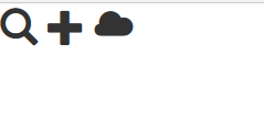
原文链接: https://www.cnblogs.com/ncepubye/p/12724004.html
欢迎关注
微信关注下方公众号,第一时间获取干货硬货;公众号内回复【pdf】免费获取数百本计算机经典书籍;
也有高质量的技术群,里面有嵌入式、搜广推等BAT大佬

原创文章受到原创版权保护。转载请注明出处:https://www.ccppcoding.com/archives/396491
非原创文章文中已经注明原地址,如有侵权,联系删除
关注公众号【高性能架构探索】,第一时间获取最新文章
转载文章受原作者版权保护。转载请注明原作者出处!