
BFC规范:
格式化上下文(Formatting Context)是W3C规范中的一个概念,它是页面中的一块渲染区域,并且有一套渲染规则,它决定了其子元素将如何定位,以及和其他元素的相关和相互作用。
BFC即Block Formatting Context(块级上下文格式化),它属于上述中的其中一种规范,具有BFC特性的元素可以看作是隔离了的独立容器,容器里面的元素不会在布局上影响到外面的元素,并且BFC具有普通容器所没有的一些特性。
能够出发BFC的样式:
1. 浮动元素, left或者right
2. 绝对定位元素,position (absolute, fixed)
3. display为 inline-block,table-cells,flex
4. overflow除了visible以外的值(hidden, auto, scroll)
---------------------------------------------------------------------------------------------------------------------------------------------
BFC特性及应用:
1. 解决margin叠加问题
例如,下面的两个元素的margin会产生互相叠加的问题:
<!DOCTYPE html>
<html lang="en">
<head>
    <meta charset="UTF-8">
    <title>document</title>
    <style>
        .div1{
            width: 100px;
            height: 100px;
            background: red;
            margin-bottom: 30px;
        }
        .div2{
            width: 100px;
            height: 100px;
            background: blue;
            margin-top: 30px;
        }
    </style>
</head>
<body>
    <div class="div1"></div>
    <div class="div2"></div>
</body>
</html>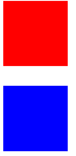

所以在上述两个元素之外再加一个容器,且触发BFC规范,可以解决元素上下margin的叠加问题:
<!DOCTYPE html>
<html lang="en">
<head>
    <meta charset="UTF-8">
    <title>document</title>
    <style>
        .div1{
            width: 100px;
            height: 100px;
            background: red;
            margin-bottom: 30px;
        }
        .div2{
            width: 100px;
            height: 100px;
            background: blue;
            margin-top: 30px;
        }
        .box{
            overflow: hidden;
        }
    </style>
</head>
<body>
    <div class="box">
        <div class="div1"></div>
    </div>

    <div class="box">
        <div class="div2"></div>
    </div>
</body>
</html>
2. 解决margin传递问题
<!DOCTYPE html>
<html lang="en">
<head>
<meta charset="UTF-8">
<title>document</title>
<style>
.div1{
width: 200px;
height: 200px;
background: red;
}
.div2{
width: 100px;
height: 100px;
background: blue;
margin-top: 50px;
}
</style>
</head>
<body>
<div class="div1">
<div class="div2"></div>
</div>
</body>
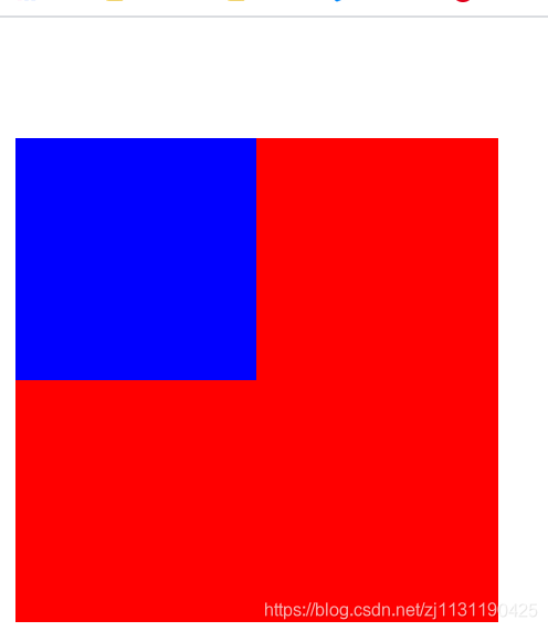
</html>上述的代码中,为蓝色的盒子添加margin-top=50px, 导致外层的红色盒子也具有了50px的margin-top,所以两个盒子会一起向下移动,这就是margin的传递问题:
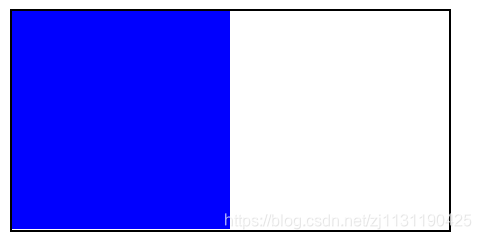
所以需要对外层的容器出发BFC,使得外层容器成为一个独立的容器,不受内层容器的影响。
<!DOCTYPE html>
<html lang="en">
<head>
    <meta charset="UTF-8">
    <title>document</title>
    <style>
        .div1{
            width: 200px;
            height: 200px;
            background: red;
            /*overflow: auto;  !*hidden*!*/   /*都可以出发BFC*/
            position: absolute;
        }
        .div2{
            width: 100px;
            height: 100px;
            background: blue;
            margin-top: 50px;
        }

    </style>
</head>
<body>
    <div class="div1">
        <div class="div2"></div>
    </div>

</body>
</html>
3.解决浮动问题
<!DOCTYPE html>
<html lang="en">
<head>
    <meta charset="UTF-8">
    <title>document</title>
    <style>
        .div1{
            width: 200px;
            border: 1px black solid;
        }
        .div2{
            width: 100px;
            height: 100px;
            background: blue;
        }
    </style>
</head>
<body>
    <div class="div1">
        <div class="div2"></div>
    </div>

</body>
</html>
当内部元素蓝色方块浮动之后,外层的容器会没有了高度
所以可以对外层的容器出发BFC,就不会受到内部元素的影响。
<!DOCTYPE html>
<html lang="en">
<head>
<meta charset="UTF-8">
<title>document</title>
<style>
.div1{
width: 200px;
border: 1px black solid;
/*出发BFC的条件*/
/*overflow: hidden;*/
/*float: left;*/
display: inline-block;
}
.div2{
width: 100px;
height: 100px;
background: blue;
float: left;
}
</style>
</head>
<body>
<div class="div1">
<div class="div2"></div>
</div>
</body>
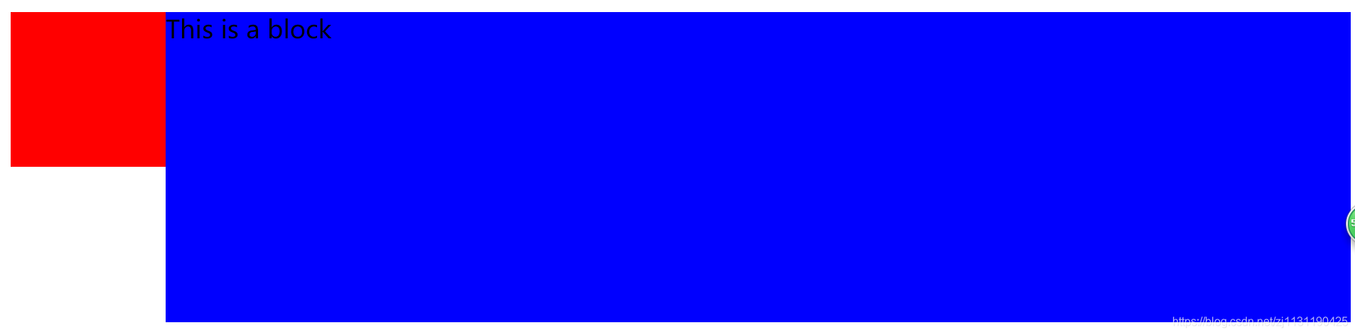
</html>4. 解决覆盖问题
<!DOCTYPE html>
<html lang="en">
<head>
    <meta charset="UTF-8">
    <title>document</title>
    <style>
        .div1{
            width: 100px;
            height: 100px;
            background: red;
            float: left;
        }
        .div2{
            height:200px;
            background: blue;
        }
    </style>
</head>
<body>
    <div class="div1"></div>
    <div class="div2">This is a block</div>
</body>
</html>
当红色元素浮动后,蓝色的元素会受到影响,但是没有覆盖掉文字,文字会默认上浮半层,可以对蓝色元素出发BFC,此时就不会受到红色元素的影响:
适合做后台管理左边栏固定,右边栏自适应宽度的应用
触发BFC的元素,可以形成一个独立的容器,不受到外界的影响,从而解决一些上述的布局问题。
CSS3基础知识
浏览器内核与浏览器前缀:
浏览器厂商以前就一直在实施CSS3,但他还未成为真正的标准,为此,当有一些CSS3样式语法还在波动的时候,他们提出了针对浏览器的前缀,去兼容不同的浏览器。针对旧的浏览器做兼容,新浏览器基本不需要添加前缀。
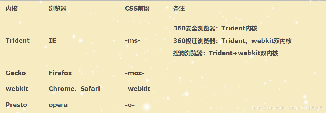
(图片来源:https://www.cnblogs.com/calamus/p/5894649.html)
transition过渡:
1. transition-property: 规定设置过渡效果的CSS属性名称
2. transition-duration:规定完成过渡效果需要多少秒或者毫秒
3. transition-delay:定义过度效果何时开始(既可以延迟(>0)也可以提前(<0))
4. transition-timing-function:规定速度效果的速度曲线
transition-timing-function速度曲线如下图所示:
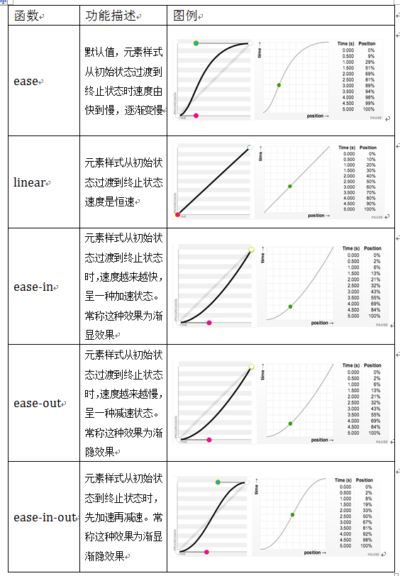
(图片来源: https://blog.csdn.net/baidu_35738377/article/details/52754026)
<!DOCTYPE html>
<html lang="en">
<head>
    <meta charset="UTF-8">
    <title>document</title>
    <style>
        .div1{
            width: 100px;
            height: 100px;
            background: red;
            transition-property: all;   /*过度宽度,高度,以及颜色, 或者all代表全部过度*/
            transition-duration: 1s;
            transition-delay: 20ms;
            transition-timing-function: linear;
        }

        .div1:hover{
            width: 200px;
            height: 200px;
            background: blue;
        }
    </style>
</head>
<body>
    <div class="div1"></div>
</body>
</html>
不能把过度的样式添加到hover上,这样才能保证在鼠标移入和移开的时候都具有过度属性。
transform位移与缩放:
1. translate: 位移
translateX
translateY
<!DOCTYPE html>
<html lang="en">
<head>
    <meta charset="UTF-8">
    <title>document</title>
    <style>
        .div1{
            width: 300px;
            height: 300px;
            border: 1px solid black;
            margin: 30px auto;
        }

        .div2{
            width: 100px;
            height: 100px;
            background: red;
            transition-duration: 2s;
            transition-property: all;
        }

        .div1:hover .div2{
            transform: translate(100px, 100px);    /*x,y方向移动的位移*/
        }
    </style>
</head>
<body>
    <div class="div1">
        <div class="div2"></div>
    </div>
</body>
</html>
2. scale:缩放(值是一个比例值,正常大小就是1)
sacleX
scaleY
会以元素中心点进行缩放
<!DOCTYPE html>
<html lang="en">
<head>
    <meta charset="UTF-8">
    <title>document</title>
    <style>
        .div1{
            width: 300px;
            height: 300px;
            border: 1px solid black;
            margin: 30px auto;
        }

        .div2{
            width: 100px;
            height: 100px;
            background: red;
            transition-duration: 2s;
            transition-property: all;
        }

        .div1:hover .div2{
            transform:scale(0.8, 0.8);
        }
    </style>
</head>
<body>
    <div class="div1">
        <div class="div2"></div>
    </div>
</body>
</html>
3. 旋转rotate :(旋转值为角度,或者弧度,正负控制顺时针逆时针旋转)
rotateX:
rotateY:
rotateZ:旋转(当前屏幕)
<!DOCTYPE html>
<html lang="en">
<head>
    <meta charset="UTF-8">
    <title>document</title>
    <style>
        .div1{
            width: 300px;
            height: 300px;
            border: 1px solid black;
            margin: 30px auto;
        }

        .div2{
            width: 100px;
            height: 100px;
            background: red;
            transition-duration: 2s;
            transition-property: all;
        }

        .div1:hover .div2{
            transform:rotateZ(45deg);
        }
    </style>
</head>
<body>
    <div class="div1">
        <div class="div2"></div>
    </div>
</body>
</html>
4. 斜切skew (角度,正负控制方向)
skewX
skewY
<!DOCTYPE html>
<html lang="en">
<head>
    <meta charset="UTF-8">
    <title>document</title>
    <style>
        .div1{
            width: 300px;
            height: 300px;
            border: 1px solid black;
            margin: 30px auto;
        }

        .div2{
            width: 100px;
            height: 100px;
            background: red;
            transition-duration: 2s;
            transition-property: all;
        }

        .div1:hover .div2{
            transform:skew(30deg, 0);
        }
    </style>
</head>
<body>
    <div class="div1">
        <div class="div2"></div>
    </div>
</body>
</html>
transform注意事项:
1. 变形操作不会影响到其他元素
2. 变形操作只能添加给块元素,不能添加给内联元素。
3. 复合写法,可以同时添加多个变形操作,但是执行是有顺序的,先执行后面的操作,再执行前面的操作。位移translate会受到scale, rotate, skew的影响。
4. transform-origin: 设置transform变换的基点
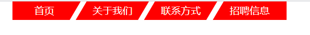
斜切的导航:
效果如下:
<!DOCTYPE html>
<html lang="en">
<head>
    <meta charset="UTF-8">
    <title>document</title>
    <style>
        *{
            margin: 0;
            padding: 0;
        }
        ul{list-style: none}

        ul{
            width: 440px;
            margin: 0 auto;
            overflow: hidden;
        }

        ul li{
            float: left;
            width: 100px;
            height: 30px;
            background: red;
            color: white;
            text-align: center;
            line-height: 30px;
            margin: 0 5px;
            transform: skewX(-30deg);

        }
        ul li span{
            display: block;
            transform: skewX(30deg);
        }

        ul li:first-child{
            padding-left: 10px;
            margin-left: -10px;
        }

        ul li:last-child{
            padding-right: 20px;
            margin-right: -20px;
        }

        ul li:hover{
            background: blue;
            cursor: pointer;
        }


    </style>
</head>
<body>
    <div>
        <ul>
            <li class="active"><span>首页</span></li>
            <li><span>关于我们</span></li>
            <li><span>联系方式</span></li>
            <li><span>招聘信息</span></li>
        </ul>
    </div>
</body>
</html>
变形的列表
<!DOCTYPE html>
<html lang="en">
<head>
    <meta charset="UTF-8">
    <title>document</title>
    <style>
        *{
            margin: 0;
            padding: 0;
        }
        ul{list-style: none}
        a{
            text-decoration: none;
        }
        img{

            display: block;
        }

        .list{
            width: 250px;
            margin: 30px auto;
        }
        .list li{
            width: 100%;
            height: 97px;
            border-bottom: 1px dashed #d0d6d9;
            overflow: hidden;
        }
        .list .list-photo{
            float: left;
            width: 112px;
            height: 77px;
            margin: 10px 9px 0 5px;
            position: relative;
        }
        .list .list-text{
            float: left;
            width: 114px;
            font-size: 12px;
            line-height: 21px;
            margin-top: 10px;
        }

        .list .list-photo img{
            width: 100%;
            height: 100%;
        }

        .list .list-photo .list-photo-border{
            width: 92px;
            height: 57px;
            border: 1px solid white;
            position: absolute;
            left: 9px;
            top: 9px;

            transform: translate(0, -20px) rotate(-90deg);
            transition-property: all;
            transition-duration: 500ms;
            transition-timing-function: linear;
            transform-origin: 0 0;
        }
        .list .list-photo .list-photo-text
        {
            color: white;
            text-align: center;
            position: absolute;
            width: 100%;
            bottom: 10px;
            font-size: 14px;

            transform: translate(0, 100px);
            transition-property: all;
            transition-duration: 500ms;
            transition-timing-function: linear;
        }
        .list li:last-child{
            border-bottom: none;
        }

        /*写过渡效果:*/     /*先做终点的位置,再做起点的位置*/
        .list li:hover .list-photo-border{
            transform: translate(0, 0) rotate(0);
        }

        .list li:hover .list-photo-text{
            transform: translate(0, 0);
        }


    </style>
</head>
<body>
    <ul class="list">
        <li>
            <div class="list-photo">
                <img src="../picture/transform_list/0013.png" alt="" title="">
                <div class="list-photo-border"></div>
                <div class="list-photo-text">陌陌上市</div>
            </div>
            <div class="list-text">
                <p>测试文字测试文字测试文字</p>
            </div>
        </li>
    </ul>
</body>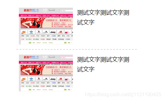
</html>效果如网址:http://www.lvyestudy.com/jquery/jq_2.3.aspx左边图片栏所示,当鼠标移动到图片上的时候,图片上的文字和边框会呈现出过渡效果。
CSS3背景扩展:
1. background-size:背景图的尺寸大小
cover: 覆盖
contain: 包含
也可以设置具体大小
背景图效果:
<!DOCTYPE html>
<html lang="en">
<head>
    <meta charset="UTF-8">
    <title>Title</title>
    <style>
        .box{
            width: 300px;
            height: 300px;
            border: 40px solid black;
            background: url("../picture/others/timg1.jpg") no-repeat;
            /*background-size: 300px 200px;*/
            /*background-size: cover;*/
            background-size: contain;
        }
    </style>
</head>
<body>
    <div class="box"></div>
</body>
</html>
2. background-origin:背景图的填充方式
padding-box: (默认) 在padding区域就开始进行填充
border-box: 在边框区域进行填充
content-box 在content区域进行填充
<!DOCTYPE html>
<html lang="en">
<head>
    <meta charset="UTF-8">
    <title>Title</title>
    <style>
        .box{
            width: 300px;
            height: 300px;
            border: 40px solid rgba(0,0,0,0.5);
            background: url("../picture/others/timg1.jpg") no-repeat;
            padding: 30px;
            /*background-origin: padding-box;*/
            /*background-origin: border-box;*/
            background-origin: content-box;
        }
    </style>
</head>
<body>
    <div class="box"></div>
</body>
</html>
3. background-clip:背景图的裁切方式
padding-box: (默认)
border-box
content-box
CSS中的渐变:
1. linear-gradient: 线性渐变
point || angle 渐变的0度在区域的下方
color
percentage
<!DOCTYPE html>
<html lang="en">
<head>
    <meta charset="UTF-8">
    <title>Title</title>
    <style>
        .box{
            width: 300px;
            height: 300px;
            border: 1px solid black;
            /*background-image: linear-gradient(red, blue);*/
            background-image: linear-gradient(red 25%, blue 80%);
        }
    </style>
</head>
<body>
    <div class="box"></div>
</body>
</html>
2. radical-gradient:径向渐变
point
color
percentage
<!DOCTYPE html>
<html lang="en">
<head>
    <meta charset="UTF-8">
    <title>Title</title>
    <style>
        .box{
            width: 300px;
            height: 300px;
            border: 1px solid black;
            background-image: radial-gradient(red, blue);
        }
    </style>
</head>
<body>
    <div class="box"></div>
</body>
</html>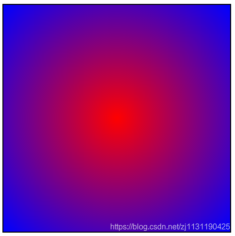
font-face字体图标
font-face是CSS3中的一个模块,它主要是把自定义的web字体嵌入到你的网页中
好处:
1. 可以非常方便的改变大小和颜色(一些小的图标也可以当作自定义的字体嵌入到网页中,这比图片更加方便)(font-size, color)
2. 放大后不会失真
3. 减少请求次数和提高加载速度
4. 简化网页布局
5. 减少设计师和前端工程师的工作量
6. 可使用计算机没有提供的字体
使用:
@font-face语法实现
矢量图标库:https://www.iconfont.cn/
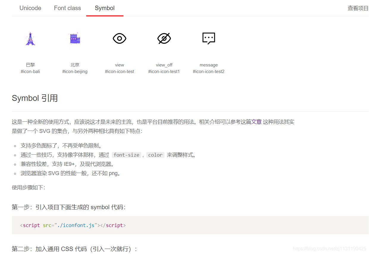
黑白图标引用:
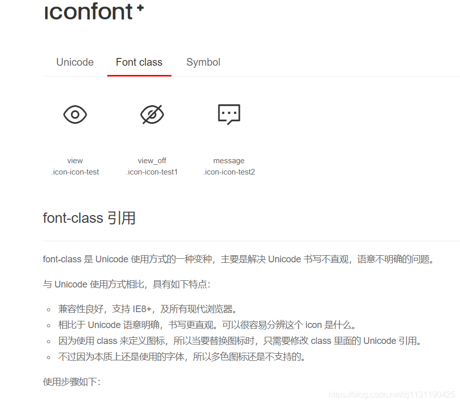
1. 将图标添加至项目:
2. 将图标下载到本地
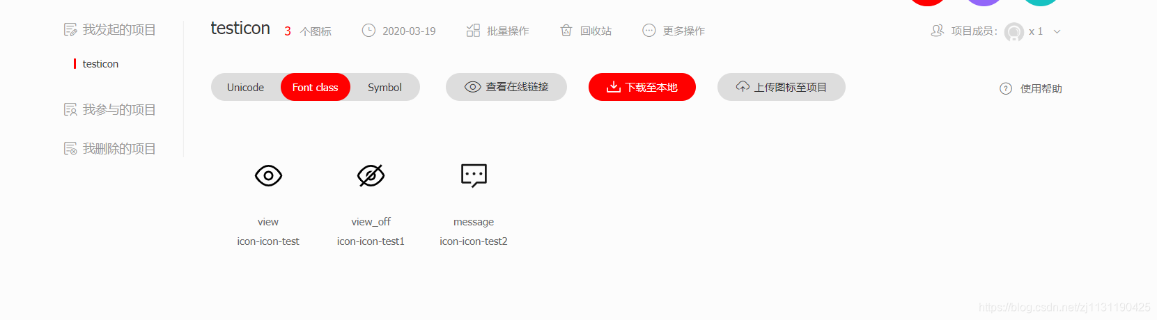
3. 解压文件
将字体图标文件放到目录下: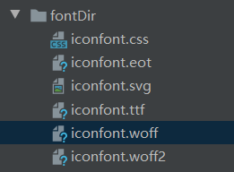
4. 引入字体文件:
打开demon_index.html文件
<!DOCTYPE html>
<html lang="en">
<head>
    <meta charset="UTF-8">
    <title>Title</title>
    <link rel="stylesheet" href="../picture/fontDir/iconfont.css">
    <!--需要调整样式-->
</head>
<body>
    <span class="iconfont icon-icon-test"></span>
    <span class="iconfont icon-icon-test1"></span>
</body>
</html>
引用效果: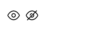
彩色图标引用:
引入彩色图标,需要将JS文件添加到目录,以及引入JS文件才可以使得文件为彩色。
相应的使用方法:
<!DOCTYPE html>
<html lang="en">
<head>
    <meta charset="UTF-8">
    <title>Title</title>
    <!--引入彩色图标, 需要引入JS文件-->
    <link rel="stylesheet" href="../picture/fontDir_color/iconfont.css">
    <script src="../picture/fontDir_color/iconfont.js"></script>
    <style>
        .icon {
            width: 1em;
            height: 1em;
            vertical-align: -0.15em;
            fill: currentColor;
            overflow: hidden;
        }
    </style>
</head>
<body>
    <svg class="icon" aria-hidden="true">
        <use xlink:href="#icon-bali"></use>
    </svg>
</body>
</html>
----------------------------------------------------------------------------------------------------------------------------------------------
原文链接: https://www.cnblogs.com/ncepubye/p/12723991.html
欢迎关注
微信关注下方公众号,第一时间获取干货硬货;公众号内回复【pdf】免费获取数百本计算机经典书籍;
也有高质量的技术群,里面有嵌入式、搜广推等BAT大佬

原创文章受到原创版权保护。转载请注明出处:https://www.ccppcoding.com/archives/396439
非原创文章文中已经注明原地址,如有侵权,联系删除
关注公众号【高性能架构探索】,第一时间获取最新文章
转载文章受原作者版权保护。转载请注明原作者出处!